Keep the character clear
Personality comes before decoration.
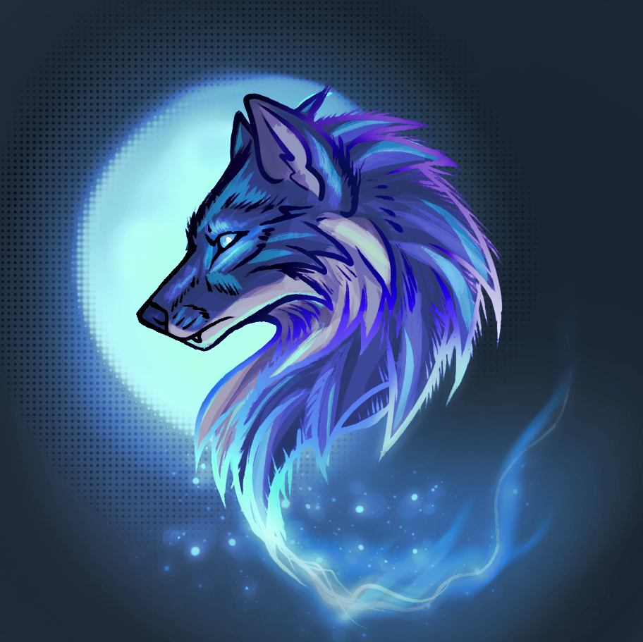
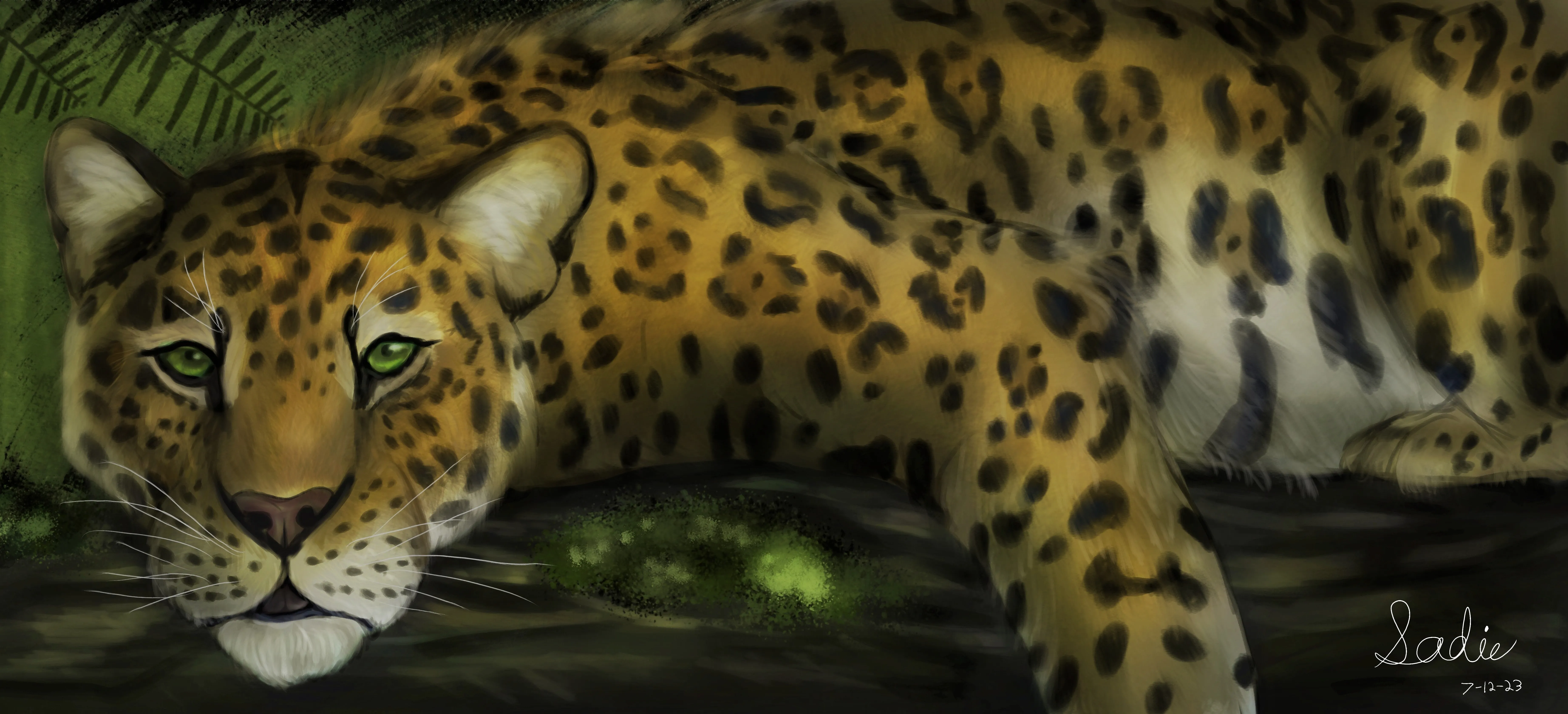
Strong animal artwork lets the subject lead. Before choosing scenery or effects, it helps to decide what the animal should communicate at first glance. A wolf can feel watchful and calm. A big cat can feel sun-warmed, distant, and perfectly in control. A bird can feel delicate, stubborn, or electric. The pose, eye line, silhouette, and color direction should make that reading immediate.
Once the personality is clear, the imaginative details have a job to do. A deep blue night can make pale fur feel luminous. A ridge of fire can sharpen a dragon's energy. Feathers, horns, scars, unusual markings, or a glow around the eyes can turn a familiar shape into something unmistakable. The point is not to add everything. It is to choose the details that make the creature feel more itself.
This approach works for wildlife-inspired art as well as fully imagined creatures. A real animal can be the emotional anchor for a bolder scene. An original character can borrow the balance, movement, or expression of a known species. In both cases, the finished piece has more staying power when the animal remains believable underneath the color and atmosphere.
Consider the details in layers. First comes the silhouette, because it is what you notice from across the room. Then comes the face, the pose, and the colors that establish the mood. Last come the smaller touches: a worn collar, a scar, a bright feather, a particular kind of flower, or the hint of weather on the horizon. That order keeps the artwork readable at a glance while rewarding a closer look.
It also helps to choose one or two details that are non-negotiable. Perhaps the eyes need to look gentle, the markings must stay asymmetrical, or the setting should feel like late summer rather than a dark forest. Naming those priorities is more useful than trying to describe every inch of the image. It gives the piece a strong center and lets the artwork keep its sense of movement.